When the App Store launched, there was one iPhone with one screen size and one pixel density. Designing your user interfaces was relatively simple and the technical debt of hard-coding them was cheap. Today, developers and designers face many challenges in creating apps that must work on dozens of different devices. Long gone are the days of 480x320. We can no longer depend on physical screen sizes and must always be prepared for the next generation of devices.
Devices have traits
In iOS 8, Apple introduced a new level of abstraction in the UIKit framework — UITraitCollection, an addition to iOS that has as far-reaching implications for developers as it does for designers, if not more.
A UITraitCollection object describes the properties, or traits, of a user interface (UI) element. These traits define a display scale (a Retina or non-Retina display), the user interface idiom (an iPhone or iPad), and most importantly a vertical and a horizontal size class. When combined with Auto-Layout, these new APIs empower developers and designers to redefine the ways in which they conceptualize their user interfaces. Trait collections complete our repertoire for designing adaptive UI.
Just as the iPhone 6 Retina HD display further reinforces the mandate for us to think about layouts in terms of abstract points rather than pixels, trait collections guide us into thinking about layouts in an entirely new manner. With trait collections, we can reason about device screen dimensions, orientations, and user interfaces in a generalized way.
Size classes
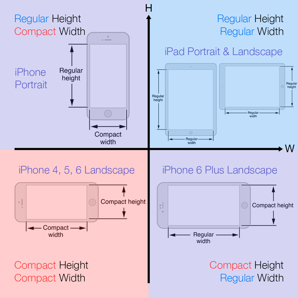
A size class identifies a relative amount of display space for a UI element. There are two primary size classes in iOS 8, compact and regular. Every screen or view defines a size class for both its horizontal and vertical dimensions — that is, its width and height. Describing each dimension with a size class results in a total of four options: compact width, regular width, compact height, regular height. The size classes for all iOS devices are defined in the following diagram.

iOS 8 size classes by device. Device images taken from What's New in iOS 8.
There’s a lot of information in this diagram. Let’s break down the most important details:
-
We no longer have dozens of physical devices. We have four abstract devices: Regular-Compact, Regular-Regular, Compact-Compact, Compact-Regular.
-
All iPhones (top left) in the portrait orientation have a regular height and a compact width. This means that your UI should behave and appear nearly the same on an iPhone 4S as it does on an iPhone 6 Plus.
-
All iPads (top right) in any orientation have a regular size class for both dimensions.
-
In the landscape orientation, iPhone 4/S, iPhone 5/S, and iPhone 6 (bottom left) have a compact size class for both dimensions. This is incredibly important as it highlights that physical device dimensions and size classes do not correspond one-to-one. For example, consider the iPhone 5. When in the portrait orientation it has a regular height and a compact width. Knowing this, your intuition may lead you to believe that when the device rotates, the size classes also “rotate” to yield a compact height and a regular width. However, this is not the case. When in the landscape orientation, the iPhone 5 has a compact width.
-
The iPhone 6 Plus in the landscape orientation is unique (bottom right). It is currently the only device that adopts a compact height and a regular width. In iOS 8, we find that this means when the iPhone 6 Plus is in the landscape orientation, its UI behaves similarly to the iPad. For example, Mail displays as a split view with the list of emails on the left and the currently selected email content on the right.
It is also possible for views, subviews, and view controllers to have size classes that differ from the “device” size classes above. There could even be multiple views or view controllers displaying on screen simultaneously, each with unique size classes. For example, a popover on iPad could be Regular-Compact, which means it would display full-screen on an iPhone. However, this is a minor detail. The code that you write should only be concerned with doing the right thing for the appropriate size classes.
Finally, I should note that iOS 8 also provides an unspecified size class, which essentially means any size class. In other words, an unspecified size class means that a view should always display and behave the same way, regardless of other UI elements or the current device.
Working in a new dimension
What do these changes mean? Developers and designers should abandon thinking in terms of pixels and devices in favor of thinking in terms of size classes and adaptive layouts. Creating pixel-perfect mockups is no longer feasible. Don’t ask how a UI layout should look on an iPhone. Instead, ask how it should appear for a regular height and a compact width. How should the content change for a regular width? For a compact height? Should certain UI elements move to new locations? Should certain UI elements hide or appear? Should any UI elements change size? These are the kinds of questions that we need to be asking and answering.
Implementing adaptive UI successfully requires thinking about the attributes of devices, not devices themselves. For designers, investigating the built-in apps in iOS 8 on different devices is a great place to see examples and start understanding these new paradigms. Developers, see the Size Classes Design Help developer guide.
Adapting to future devices
With iOS 8, Apple has provided developers and designers with the tools they need to prepare for the future. Which size classes will the next iPhone have? The next iPad? Will there be new size classes? I’m looking at you, Apple Watch.